User Interface
This page describes the user interface framework of the Tinman 3D SDK.
Overview
The user interface framework can be used to assemble a hierarchy of graphical user interface components, to allow the user to interact with the application.
This framework is not supposed to be yet another fully-featured GUI library. Instead, it has a been designed for specific use-cases and requirements and thus has a limited but well-chosen feature set. An application may decide to use this framework, on a purely optional basis.
These are the design considerations of this framework:
-
Very lightweight and highly embeddable
-
Compact and simple API, using standard concepts like layout grids and stylesheets
-
Intuitive user experience, with a set of standard components
Layout Grids
The layout of the components (i.e. their position and size) in a user interface hierarchy is computed automatically, based on a number of layout properties.
The basic concept is the layout grid, whose cells each contain zero or more components. Each component has user-defined grid bounds (row/column index, row/column count), which in turn defines the dimensions of the layout grid (row/column count).
| The LayoutGrid class implements the layout computations for a single axis. The Container class uses two layout grids, one for the horizontal and vertical axes each. |

The Layout class represents a set of layout properties for a single component:
- LayoutGrid
-
Specifies the row and column of the component’s layout cell in the parent’s layout grid. The layout cell may span one or more rows and columns in the layout grid.
- LayoutMargin
-
Specifies the distance from the layout cell to the bounds of the component, separately for each of the four edges.
- LayoutSize / LayoutLimit
-
Specifies the minimum and maximum size of the component.
- LayoutGrow
-
Specifies that the layout cell may grow when there is more space available than the minimum required size.
- LayoutShrink
-
Specifies that the layout cell may shrink when there is less space available than the minimum required size, which will trigger scrolling.
- LayoutFill
-
Specifies the axes along which the component shall be maximized to fill the whole layout cell, excluding the margin.
- LayoutAlign
-
Specifies the position of the component in the layout cell, if the cell is greater than the component.
- LayoutInsets
-
Specifies the distance from the component’s bounds to the bounds of its layout grid, separately for each of the four edges.
If the final layout size of a component is smaller than its minimum size, only a sub-rectangle of its bounds will be visible. In this case, scrolling may be applied to move the visible sub-rectangle, by using the IScrollable interface. Usually, this is done by attaching the scrolling component to a ScrollBar.
Visual Styles
User interface components do not store visual style information themselves. Visual styles are defined with Stylesheet objects, which may be referenced by components. If a component does not reference a stylesheet, its parent’s stylesheet will be used.
Visual style properties are represented with StyleProperty objects, which are enumerated by the Style class. When setting the value of a property in a stylesheet of a component with the StyleProperty.Set method, a StyleClass must be specified, either explicitly as method parameters or implicitly via Component.StyleClassType and Component.StyleClassVariant. When the value of a style property is queried with StyleProperty.Get, the most specific style class is probed first, cascading to the next lesser specific style class if not found. If necessary, this is repeated recursively for stylesheet of the parent component.
Component component = ...;
long textColor;

// Set style property for style class of component.
Style.TextColor.Set(component, Colors.Red);

// Query style property, cascading as necessary.
textColor = Style.TextColor.Get(component);

// Unset style property, will cascade to parent.
Style.TextColor.Unset(component);
The following pre-defined StyleProperty objects can be found as constants in the Style class:
- Colors
-
BackgroundColor
ForegroundColor
HighlightColor
TextColorThese stylesheet colors are used to create a ColorScheme object, which produces a set of standard color shades for rendering GUI elements.
- Decoration
- Layout
- Text
- Other
Components
The Component class is the base of all user interface components. It provides the common infrastructure for layout settings, visual styles, scrolling and some other things.
| Gesture | Command |
|---|---|
Shift + Left → Click |
Focus the component under the mouse cursor. |
The Container class is used to group components in order to create hierarchies.
The Panel class is a container that adds visual decoration.
The RootContainer class is a container that can be used to place a user interface hierarchy at the specified bounds of a graphics canvas.
Choice
The Choice component displays one or more choice items, from which the user may pick one. By default, choice items are arranged vertically, in a list.
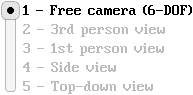
Optionally, the choice items may be arranged horizontally, for presenting simple choices in a single row.

| Gesture | Command |
|---|---|
Left → Click or Drag |
Select the choice item under the mouse cursor. |
| Key | Command |
|---|---|
ArrowLeft or ArrowUp |
Select previous choice. |
ArrowRight or ArrowDown |
Select next choice. |
Home |
Select first choice. |
End |
Select last choice. |
Digit1 … Digit9 |
Select 1st … 9th choice. |
Digit0 |
Select 10th choice. |
ClickButton
The ClickButton component is a clickable button, with an optional icon, label and shortcut key.
Buttons may have toggle semantics, where the button toggles between the pressed and released states.

| Gesture | Command |
|---|---|
Left → Press |
Press the button down. |
Left → Release |
Release the button up. |
Left → Click |
Click the button. |
| Key | Command |
|---|---|
Space or Return → Press |
Press the button down. |
Space or Return → Release |
Release the button up. |
Space or Return → Click |
Click the button. |
DataGrid
The DataGrid component displays a user-defined data model with a user-defined view.
The data model and view must be provided as IDataModel and IDataView objects, instantiated from one of the built-in implementations or from a custom implementation in client-code.
The data model represents a list of data rows, where each row may optionally have an aggregated data model as its child.
The data view is responsible for creating and updating the user interface components that display the value of a each data model row.
| Gesture | Command |
|---|---|
Middle → Drag |
Scroll by dragging around the visible content. |
Wheel |
Scroll up and down. |
| Key | Command |
|---|---|
Selection |
|
ArrowDown |
Select the next visible item. |
ArrowUp |
Select the previous visible item. |
ArrowRight |
Expand the selected item, if applicable. Otherwise, select the next visible item. |
ArrowLeft |
Collapse the selected item, if applicable. Otherwise, select the parent item. |
Home |
Selects the first visible item. |
End |
Selects the last visible item. |
Scrolling |
|
Shift+ArrowLeft |
Scroll a bit to the left. |
Shift+ArrowRight |
Scroll a bit to the right. |
Shift+ArrowUp |
Scroll a bit up. |
Shift+ArrowDown |
Scroll a bit down. |
Shift+PageUp |
Scroll a page up. |
Shift+PageDown |
Scroll a page down. |
Shift+Home |
Scroll completely to the left. If already scrolled left, scroll completely to the top. |
Shift+End |
Scroll completely to the right. If already scrolled right, scroll completely to the bottom. |
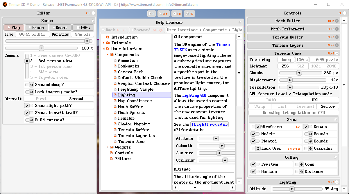
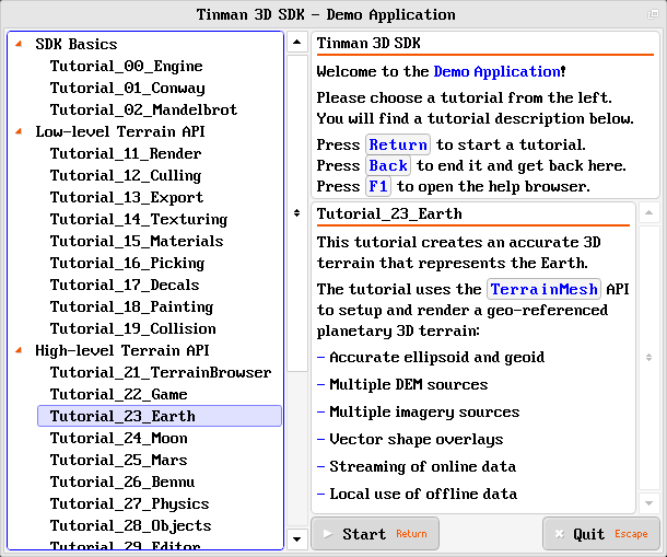
DocumentBrowser
The DocumentBrowser component displays a hierarchical document index and the content of the chosen document.
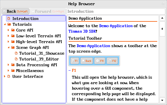
The document index is read from a given TextDocument, which contains nested lists and links to the document files to show.
The navigation tree is displayed with a DataGrid component and the document content is displayed with a DocumentView component.
Choosing an item in the navigation tree will display the corresponding document in the content area. Use the Back and Forward buttons to navigate through the visited documents. The text field above the content area shows the navigation tree breadcrumbs of the current document.
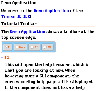
DocumentView
The DocumentView component renders a IDocumentNode, which is usually a TextNode.
| Gesture | Command |
|---|---|
Left → Click |
Activate the hovered document link, if any. |
Left or Right or Middle → Drag |
Scroll by dragging around the visible content. |
Wheel |
Scroll up and down. |
| Key | Command |
|---|---|
ArrowLeft |
Scroll a bit to the left. |
ArrowRight |
Scroll a bit to the right. |
ArrowUp |
Scroll a bit up. |
ArrowDown |
Scroll a bit down. |
PageUp |
Scroll a page up. |
PageDown |
Scroll a page down. |
Home |
Scroll completely to the left. If already scrolled left, scroll completely to the top. |
End |
Scroll completely to the right. If already scrolled right, scroll completely to the bottom. |
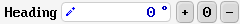
InputField
The InputField component provides a single-line text-based input field.
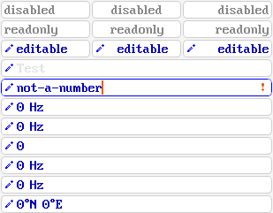
Input fields may be disabled (no modification, no selection, no copy&paste), readonly (no modification) and editable. Editable input fields may have an input prompt, which is displayed while the input is still empty.
The text input may be constrained to some format, for example to allow only decimal numbers to be input. The input value may have a display unit.
| Gesture | Command |
|---|---|
Left → Press or Drag |
Place cursor or select text. |
Right → Click |
Extend the selection to the whole input. |
| Key | Command |
|---|---|
Input |
|
<char> |
Replace the contents of the selection with the input character. If the selection is empty, insert the input character at the cursor. |
Return |
Validate the current input. If the input is already valid, yield the input focus. |
Escape |
Discard changes and revert to the last valid input. If the input is already valid, clear the selection. If the selection is empty, yield the input focus. |
Backspace |
Delete the contents of the selection. If the selection is empty, delete the character to the left of the cursor. |
Del |
Delete the contents of the selection. If the selection is empty, delete the character to the right of the cursor. |
Cursor |
|
ArrowLeft |
Move the cursor to the left by one character. |
ArrowRight |
Move the cursor to the right by one character. |
ArrowUp or Home |
Move the cursor to the start of the current input. |
ArrowDown or End |
Move the cursor to the end of the current input. |
Selection |
|
Control+A |
Extend the selection to the whole input. |
Shift+ArrowLeft |
Extend the selection by one character at the start. |
Shift+ArrowRight |
Extend the selection by one character at the end. |
Shift+ArrowUp Shift+Home |
Extend the selection to the start of the current input. |
Shift+ArrowDown Shift+End |
Extend the selection to the end of the current input. |
Copy & Paste |
|
Control+C |
Copy the contents of the selection to the system clipboard. |
Control+V |
Replace the contents of the selection with the contents of the system clipboard. If the selection is empty, insert the contents of the system clipboard at the cursor. |
Control+X |
Copy the contents of the selection to the system clipboard. Then delete the contents of the selection. |
LabelView
The LabelView component displays a textual label.

Panel
The Panel component is used to group child components.
Panel may be collapsible and may be grouped: if a panel is expanded, then all other panels in the group are collapsed. This creates an accordion-style behaviour.
Panels in a Widget GUI may additionally have a key shortcut.
| Gesture | Command |
|---|---|
Left → Click |
Collapse / expand the panel (when clicking the title bar) |
Middle → Click |
Collapse / expand the panel |
Middle → Drag |
Scroll by dragging around the visible content. |
QuantityEditor
The QuantityEditor component displays a numeric input field with additional buttons for incrementing, decrementing and resetting the input value.
| Key | Command |
|---|---|
NumpadAdd |
Increment the quantity value, same as clicking +. |
NumpadSub |
Decrement the quantity value, same as clicking -. |
Backspace |
Reset the quantity value, same as clicking 0. |
ScrollBar
The ScrollBar component displays a horizontal or vertical scrollbar.

| Gesture | Command |
|---|---|
Left → Click |
Scroll by one tick, when clicking one of the buttons. Scroll by one page, when clicking into the space between the knob and the adjacent button. |
Left → Drag |
Scroll by dragging the knob. |
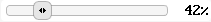
Slider
The Slider component shows a horizontal slider bar, for choosing a value in a pre-defined range.
| Gesture | Command |
|---|---|
Left → Press or Drag Right → Press or Drag |
Update the value by moving the knob. |
Right → Click |
Reset to the default value. |
Wheel |
Increment / decrement the value by the configured step. |
Shift+Wheel |
Increment / decrement the value by one. |
Control+Wheel |
Set the maximum / minimum value. |
| Key | Command |
|---|---|
ArrowLeft |
Decrement the value by the configured step. |
ArrowRight |
Increment the value by the configured step. |
Shift+ArrowLeft |
Decrement the value by the one. |
Shift+ArrowRight |
Increment the value by the one. |
Control+ArrowLeft |
Set the minimum value. |
Control+ArrowRight |
Set the maximum value. |
SwitchButton
The SwitchButton component is a binary choice between on/off.
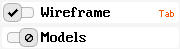
A switch button has a label and an optional shortcut key.
| Gesture | Command |
|---|---|
Left → Click |
Turn the switch on, when clicking on the left half of the knob area. Turn the switch off, when clicking on the right half of the knob area. Toggle between on / off, when clicking anywhere else. |
| Key | Command |
|---|---|
Space or Return |
Toggle between on / off. |
ArrowLeft |
Turn the switch on. |
ArrowRight |
Turn the switch off. |
Widget GUI
The IWidgetGui interface is used to provide a simple desktop-like user interface for IWidget objects. The widget GUI is fully optional, widgets are not required to make use of it.
Panels
At the left and right screen edges, the widget GUI has collapsible user interface panels, which may be populated with panels via IWidgetGui.PanelAdd.
Toolbar
At the center of the top screen edge, there is a toolbar, which may be filled with buttons via IWidgetGui.ButtonAdd.
Content
The center region between the user interface panels is used to display widget content. Its extends may be queried with INonUserInterfaceBounds.
Dialogs
Modal and non-modal dialogs may be shown in the center region of the widget GUI. The WidgetDialog class may be used as the base class to implement custom dialogs.
Localization
GUI components support localization / customization of labels by implementing the ILocalizable interface and by providing label constants via LocalizedAttribute:
Client code may use the ILocalizable.Localize2 method to specify custom label texts, which are usually sourced from a native localization framework (for example resource bundles).